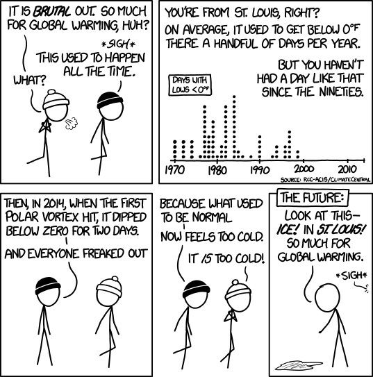
I love this comic. In the past few weeks I have heard at least 3 impromptu lectures, normally at top volume, on the general theme of "WOW IT'S COLD OUT! SEE? CLIMATE CHANGE TOTALLY ISN'T REAL! STUPID SCIENTISTS! HAHAHAHAHAHA!" This comic does a great job of explaining why that sort of statement doesn't make much sense.
People, by their nature, are not normally very good at looking at long range problems. If it isn't something happening right now then it probably isn't going to get much attention. Because of this, humans are always going to struggle with concepts like Climate Change and Evolution because neither of them are happening right now. Well, technically they are but the results aren't immediately visible.
Students, being people, also have this problem. Students, being teenagers, also have additional problems like acne, the girl that sits in front of them in Algebra, soccer practice, prom dates, what to do on the weekend, who they hate this week and, of course, their parents. With all of these additional problems it makes it incredibly unlikely that they will pay attention if you are telling them things unless those things will immediately impact them. All teachers have experience with this to some extent. "There is a test on Friday," isn't nearly as likely to drive the students to study as "There is a test tomorrow." Additionally, "There is a test in 6 minutes," is where you will see the most studying, mostly by students who ignored the first two statements.
It is for this reason that I have taken to not telling them about climate change. Oh, it isn't as if the

The activity I use takes one of two forms. Before each student had a chromebook I would give the students printouts of actual data sets from NOAA, The Hadley Centre, the World Bank, and others and ask the students to make several different graphs of the data. For example, one of the graphs would be from the Hadley Centre data on temperature anomalies of the past century while another graph was from the World Bank data on oil consumption since the 1960's. The students make graphs, compare the data, and determine if there is a relationship between the two data sets. This is repeated for the Hadley Centre data and the atmospheric carbon dioxide levels from NOAA and for all of the other data sets. I would then ask them to write up their conclusions on how the variables are related to each other.
Now that each student has a chromebook I share the data sets with them using Google Drive and ask them to make the graphs using Google Sheets. They then transfer these graphs to Google Docs and then do their variable analysis there. So much simpler! Also,since I totally love using these computers in my classroom, I have modified this activity for my Advanced students so that after they have made the graphs from the available data sets they must then go find alternative sources to determine if multiple data sets match up. This requires quite a bit more time and a lot more work from the students (and me!) but it is worth it.

No comments:
Post a Comment